Integrating E-commerce principles to simplify B2B gift card ordering.
Context
While this product, a web based SaaS product that supports enterprise businesses to send digital gift cards was expanding to a bigger customer base in the market. Tango Card acquired GiftCertificates.com, a rewards provider that sends both digital and physical gift cards. This created a need for the product to start supporting physical gift card ordering.
Project Goals
Improve the experience of ordering.
Support physical gift cards ordering.
Make the ordering flow responsive.
My Roles
Lead design and research that resulted in a high customer satisfaction and increase in reward value sent.
Strategized, planned and lead implementation efforts for product’s design systems.
Innovated on the model of ordering in the gift card industry that put the product as a market differentiator in ordering.
Outcome
4.7
★Customer Satisfaction
CSAT score for ordering after redesign and improvements
9%
▼Reduction in operational cost
Percentage decrease in product support tickets within 3 months of release.
47.7%
▲Increase in ordered Reward Value in USD
Value of rewards ordered in American Dollars
Prior Experience
The former flow struggled with several usability issues. Here are the top findings:

Most users couldn’t find advanced options to send multiple rewards. This led them to place several orders instead of one.
The majority of users needed advanced options to add order notes and hardly used the available advanced options.

Users had to manually add an email template to each recipient meanwhile the need was to designate an email template per campaign.
After adding a template, the field didn’t populate template names as well as the thumbnail was too small for users to confirm the template they chose.

Users couldn’t review order after completion and before checkout, they had to click back on each step to review their order.
Exploration & Ideation
Discovering the market space
Competitive analysis showed that all products in the market have the same step-by-step method of ordering. As I dive in and examine the step-by-step ordering method, it was obvious that it was not a scalable ordering method due to the volume of orders going through this product.
Aligning design with business objectives
Knowing that the company is expanding to a market that is different than its competitors, I worked on aligning design with the company objective for the potential market the company was targeting at that time.
Aha moment
Innovative ideas allow products to stand out in the market
The majority of users being internet savvy made it compelling to me to introduce an ordering method that is familiar to all users. I decided to change the structure of ordering from step-by-step to an e-commerce methodology. This was a key differentiator in the market when the product expanded to its new market base. The familiarity and flexibility of e-commerce ordering make it intuitive for users and made the product easily adoptable.

Design Questions?


Users and E-commerce Experience
Primary Users
Users who need to send multiple rewards with the same amount to participants in campaigns, where each campaign has a previously created email template(s).
Secondary Users
Users who need to send multiple rewards with the different amounts to a few participants in a campaigns, where each campaign has a previously created email template(s).
Commonalities
Users tend to:
send to maximum 30 recipients per reward
use the same email template per campaign
be internet savvy. This applies to users who use the product as well as users in the market the company is targeting.
How would the e-commerce model work for these senders? I dug deeper into the structure of the consumer e-commerce model and I defined how it would fit ordering in a B2B product.

Holistic Approach
I stepped back to see the bigger picture and the impact of introducing a new gift card ordering type across the Reward Delivery Platform by visually assessing the changes across the various user experiences the Reward Delivery Platform has to offer. The user flow is annotated with User Stories, User Journeys and potential usability improvements. This also served as a conversation piece that aligned product management and engineering teams for the upcoming changes and started a conversation about scope. The diagram served as a cross departmental reference through out the project.

Design Ideation
I used wireframes to conceptualize e-commerce ordering and start communication with product management and engineering team, getting early buy in on the concept as well as discussing potential infrastructural changes to fit this model of ordering across the Reward Delivery Platform.

Users can browse, search and filter to find gift cards.

Users can add recipients details to a gift card of choice.

Users can choose and customize an email template to the order.

Users can review and edit order.
Mobile Ordering
Enterprise products usually have various options to fit multiple customer use-cases. This causes product design limitations on small screen sizes, yet having a responsive platform and not limiting users to order gift cards on desktop only was the business direction we were taking especially after I have seen a 19% increase in users attempts to use the product on mobile devices.
I used low fidelity prototypes to research how would enterprise level functionality fit on mobile screens to make ordering responsive. Each screen had a purpose for testing and finding out users behavior when ordering using small screen size devices.

Filters
Which filters mostly used while ordering and how can we enhance the search and filters experience.

Recipients
How many recipients per gift card will be sent on small screen sizes.

Customization
What are the options users need to customize an order when sending via mobile?

Adding to Cart
When displaying the number on the cart, would it represent number of gift cards or number of recipient?

Reviewing Orders
What information to display for a user to feel confident/empower users to finalize the order?

Financial information
Adding up order amounts and fees, how can we communicate that better?
Design Iterations After Testing and Finalizing Visuals

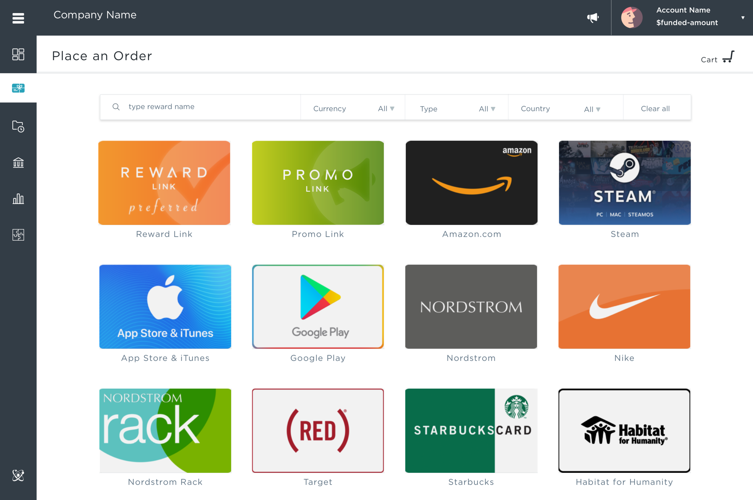
Having users land to view all available gift cards in their catalog addressed one of the key main pain points for our customers.

Using Fuzzy search to allows users to not only find a gift card they are looking for using search and filter, but also explore a range of brands while searching.

The Reward and Recipients page allows users to learn more about the brand as well as add end recipients information. Also users can switch to Mail Delivery options to send physical gift cards.

Simplifying email templates and reducing all sort of functionalities was achieved after multiple iterations. This enabled our customers to easily personalize orders for the recipients and show their brand.

Creating a Shopping Cart page gave users the flexibility to return at their convenience to review and edit orders.
Takeaways and Reflections
“Don’t make me think and make me look good”
My philosophy for B2B products is Don’t make me think and make me look good and that was achieved with the redesign. The redesign made a lot of our customers happy as it offers an improved user experience over all the ordering methods out there in the market. The aesthetics and psychology of the flow matched a familiar B2C experience while providing the features needed in an enterprise product to make customers look good.
There were a lot of hiccups along the way. The concept entailed a new infrastructure so took longer to release than anticipated and at the same time we were working on implementing a new agile development process. A lot of lessons were learned from this implementation as well as better processes were applied.
If I could change one thing through it all, I would have done user interviews earlier in the process before the prototyping phase. this would have given me better data early-on about user behaviors which wold have positively reflected on the first design iteration.