Making rewards awesome to receive
Context
Reward link is the company’s main gift card and it is a very popular product because it gives recipients the flexibility of choice, so customers tend to send it very frequently. Attention to this product increased when the world got into the pandemic because of the concept of a person receiving electronic monetary value that can be virtually redeemed to multiple options. This became a business vision.
When I got assigned to work on the the product and I knew it was left stagnant for some time, I recommended and lead a usability assessment before scaling towards the business vision.
Project Goals
Product usability assessment & improvements
My Roles
Lead design and research work.
Strategized and planned design efforts & iterative rollouts.
Lead experience design efforts for accessibility - screen readers.
Lead UI efforts for product color theme and style guide update for accessibility.
Outcome
50%
▼Decrease in monthly operation cost
Customer support’s queue was to manually resend rewards.
40.7%
▼Decrease in average longest scroll
Average longest scroll/pixels
15.3%
▼Decrease in average session duration
Average session duration was recorded in seconds
Research
Starting with data
During research I relied on multiple data sources to gather a holistic vision about users behaviors and assess their overall wants and needs. These sources were user research, customer support team, survey and analytic tools. This was the first time to conduct analytics to this product so I worked closely with the product manager to define the data points we needed to gather to benchmark user behavior in addition to the product overall health.

Devices used by users to visit the product

New vs repeat users

User scroll depth on common used device sizes
User Behavior & Archetypes
After research I conducted a series of design sessions to debrief the design team with findings and start ideation. We built 4 user archetypes with a narrative to resemble the current state of the world – the pandemic - and how it affects user’s behavior when ordering online.


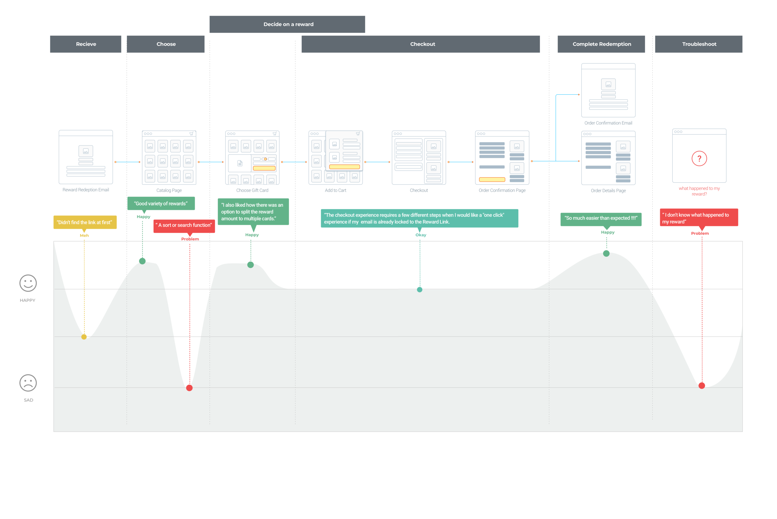
User Journey Mapping
Users were happy all throughout their journey starting with an excitement for receiving a gift card in their inbox to the final point of redeeming to a reward of their choice. But throughout their experience there were some pain points that were commonly perceived by most users.

Strategically narrowing down scope
I narrowed down the scope to the main points that will not only solve user’s pain points but will also strategically create the right building blocks for the product to scale towards the business vision.
Pain Points:
When users first received their reward, they couldn’t intuitively find the redemption URL.
Users had to scroll in a catalog of ~150 gift cards to find the brand they want.
Users didn’t know what happened to the reward they redeemed to.
Accessibility and branding issues across the experience.
Users couldn’t intuitively find the redemption URL
Usability issues with the email
The recipient experience begins with receiving an email and users are expected to click on a url to start the redemption process. Users first action was to click on the “To Redeem” label instead of the URL above. This is because the email was hard for the eye to scan with the majority of it’s components being center aligned, brand-able with different colors, and spaced inconsistently. Moreover, elements that represent customers branding in some cases caused accessibility issues regarding color contrast and readability which were not AA compliant.

The “To Redeem” label is a brand-able element so the different colors attracts users to click on it. This in addition to the label’s center alignment as well as the choice of the words “to redeem” which indicate the user to take an action.

The email was hard to scan with the majority of components being center aligned and the inconsistency in font weight and sizes.

The misuse of brand colors and spacings around components made users focus on the wrong elements in the email.

The Email had no logical flow for a user to follow with “the reward amount” floating above the gift card, “the signature” of the message being far away from the message itself, and “the order ID” is floating in the middle of the page.
Redemption email new design
The new email has consistent spacing where all contents are covered in 600px width, previously 500px, to better address customer messaging length that averages about 250-300 characters. The reward redemption section is the only centered component to grab user’s attention holding a button as the main CTA. I still provided a URL for if event tracker fails, users can still copy and paste.
Customer branding is represented as the header and the horizontal rule at the footer and font colors and sizing are WCAG AA compliant.

Constructing a logical flow for the email components with consistent spacing in between.

Brand-able components are limited to header and footer to address accessibility issues.
2. Users can’t easily find a reward of choice
Users have to browse through an average of 150 gift cards to find the gift card they want and there wasn’t a fast way to find a specific brand they are looking for. The hypothesis is Search bar is going to make it easier for recipients to find the rewards they are looking for and reduce scrolling.
Another Usability issue was once users start to interact with the page, the header that holds important information like the balance and the cart, it disappears.
“… but a filter or search function would be nice. Especially, if you continue to add choices.”
Product analytics with scroll depth on most used devices
Search and filters design explorations
Following a mobile first approach I explored introducing search, filters and categories.

Horizontal drawers addressed the current issue but it will be a component that will limit adding features to it. This was not a scalable component to implement.

A button with a label, for example “Filters”, that will open a vertical drawer was a more scalable approach.


Vertical drawer with one tier down
Vertical drawer with multiple filters
Addressing users pain point and releasing building blocks
Narrowing down search to the main goal of enhancing users life as well as releasing the main building block that will lead towards having filters and categories.

Search and filter building block component. The button can be leveraged to open a drawer with different types of filters allowing the search component to scale gracefully.

Addressing current user’s main point to search and filter on catalogs of gift cards.

I designed the search to be Fuzzy, this allows users to explore a range of brands while they are looking for a gift card of their choice.

Search and filter component sticks to the header upon scroll, this way users can always view their balance while they search and interact with filters.
Search and Filter Impact
Having a user to easily pick a reward of choice and checkout with the least friction is aligned with the product and the company mission. “ Rewards are awesome to receive”
15.3%
▼Decrease in average session duration
Average session duration was recorded in seconds
40.7%
▼Decrease in average longest scroll
Average longest scroll/pixels
3. Users didn’t have a way to view the history of their orders
After completing an order users got redirected to a redemption confirmation page. Once users opt out of this page, there was no way to return and learn what happened to the gift cards they ordered. This resulted in users reaching out to customer support for troubleshooting which reflected as 30% of customer support queue. Researching the reasons behind why recipients were not receiving their rewards showed that the most common use case is that an email have bounced or got deferred before a recipient receives the reward in their inbox.
To solve this issue, I mapped email events and simplified them to three main statuses and added appropriate messages for a recipient to learn more about what happened to their reward.

Assessing the navigation to add a new page so users can view the history of their rewards, it was obvious that the header’s component were squished to fit small screen sizes.

Header’s components are squished on small screen sizes resulting in small icons size for users to tab on.


Header improved by increasing the size of the header, removing extra text and defining tap-able areas around the icons.
Addressing users pain points by creating a redemption history page where users can see the rewards the redeemed to, the method of delivery, and the status of the rewards and the ability to troubleshoot on their own.

Redemption History Resend Impact
6% of users had the need to resent gift cards monthly. The 6% contributed to a reduction in customer support queue by 50%.
50%
▼Decrease in monthly operation cost
Customer support’s queue was to manually resend rewards.
3. Accessibility and Branding Issues
While the company was hiring a firm to conduct an accessibility assessment for the product, I lead multiple lunch and learns to discuss inclusive design as a whole and accessibility as a part of it. I also conducted workshops to explore blue-lines as deliverables.

I lead the creative designer to address holistically all company branding colors as well as product colors to address guidelines for accessibility and readability.

Reflections and Takeaways
The usability audit created the building blocks needed for the products to scale towards the business vision while improving users life while using the product. The successes of these building blocks was reflected in the data collected and the accessibility work opened up a new market sector for our sales team.
I enjoyed leading this initiative and the team as well as being able to improve upon an existing experience using quantitative and qualitative data. I enjoyed setting the product design vision as well as collaborating with various teams and strategizing to put multiple directions in motion.
If I would change one thing, I would have conducted user research after each design improvement and before release. Getting that feedback at that stage would have answered a lot of hypothesis before release.