Fostering Consistency: Leading the Team Transformation to a Unified Design System at WhitePages.
Context & Problem
When I stepped into my role as a Product Design Manager at WhitePages, one of the challenges I was hired to solve was the rampant inconsistency across their massive website. There was no consistency across the experience, and components often behaved and appeared differently from page to page. For example, something as simple as a chip would look and act one way on one page and completely differently on another. This inconsistency was driven by both the design and engineering teams, each creating slightly different versions of the same components.
The same elements were duplicated in numerous slightly different forms, making any updates slow and costly.
But I knew there was one clear solution that would truly solve this problem once and for all: establishing a design system. I proposed that we set up a comprehensive component library for WhitePages’ brand and UI through a robust design system. Under my direction, I led both the design and engineering teams to adopt this system and to create, maintain, and govern a consistent component library within the WhitePages design system. This was the passionate, definitive solution that not only tackled inconsistencies but also set a new standard for how we designed and built the product.
How I Built the Case to Leadership
I didn’t pitch a “design beautification” project instead I framed it as risk, cost, and revenue.
I made it clear to leadership that this wasn’t just about visual polish. It was about reducing risk, saving time, and supporting revenue. I conducted an audit to show how duplication was driving up development costs and walked them through how inconsistencies were impacting user experience and potentially conversions.
When I presented the case to leadership, I laid out the pros and cons and highlighted the current issues we were facing. Leadership understood the potential long-term benefits of a design system, but one of the main challenges was the reality of being a smaller company with a packed roadmap. They were concerned about how to prioritize design system work while product-focused deliverables were already in motion.
The solution we reached was to work in parallel. As developers and designers continued to work on product features, we integrated design system improvements into that workflow whenever an opportunity arose.
In practice, this meant a few things. I made sure that design deliverables always included design system requirements, so any update or new component was also considered in the context of the larger system. On the development side, engineers began estimating the additional effort required to create reusable components as part of their normal ticket estimates.
By embedding design system work into the everyday flow of product development, we were able to make consistent progress without requiring a large upfront investment of time that would derail other priorities. Over time, this approach provided us with a solid foundation and gradually shifted both the design and engineering mindset toward maintaining and valuing the system. Moreover, this approach made us capture process improvements early and adjust as both the design and the engineering teams were working toward the design system approach.
Education and Mindset Shift
Because the entire team, both engineers and designers, was new to the concept of a design system, I made education a priority. I conducted various lunch-and-learn sessions to introduce everyone to atomic design principles in detail. I partnered with a front-end engineer who was familiar with these concepts, and together we provided training for both the design and engineering teams.
For the design team specifically, I hand-crafted example components in Figma to teach them not just how to think in terms of design systems, but also how to actually build those components. This way, they could practice creating design system elements while working on their current projects.
One of the biggest challenges was shifting the design’s team mindset to think in atomic design terms before they dove into new work. Through our continuous collaboration sessions, I provided guidance on how to step back, recognize reusable patterns, and incorporate those into the design system. Even though the shift was gradual, it was effective because it allowed designers to learn and adapt while working on real projects.
Focusing on High Value Areas to Start
I started by collaborating closely with product management and relying on data to identify and tackle the pages with the highest revenue impact. By focusing on these high-value areas, we ensured that the components we were refining or creating were directly tied to business goals and frequently used in key user journeys.
Next, through my audit, I realized that we didn't have a specified grid system across the site. Being data driven, I started by assessing the viewports in Amplitude, the analytics tool, to understand how users engaged with the site on both desktop and mobile. This allowed us to prioritize the breakpoints and responsive behaviors that mattered most for the millions of users who use Whitepages.

At the same time, I leaned on the technical infrastructure already in place. Since the engineering team was using Tailwind and Flexbox, we explored how Flexbox grids could support a scalable and maintainable layout system and we created a flexible, scalable grid.


Accessibility and Inclusive Design
Another crucial aspect I tackled and educated design, engineering and Product was accessibility. An area that had previously been overlooked entirely at Whitepages. This lack of accessibility considerations not only affected the user experience but also had a direct impact on traffic from search engines like Google, since more accessible sites often rank better. To address accessibility in a holistic manner, we made sure that our color palette was thoughtfully expanded and standardized.
Under my direction, we took the existing color layout and expanded it from a limited range to a more flexible scale, from 50 to 900. This provided designers with more creative freedom while ensuring that all color choices were accessible and met WCAG guidelines. We established clear rules on which colors to use for text, backgrounds, and UI elements, ensuring a minimum of AA compliance and aiming for AAA compliance wherever possible.
We also defined typography rules to support accessibility, including clear hierarchy, legible font sizes, and sufficient contrast ratios. By combining color and typography standards, we made sure that accessibility was baked into the design system from the start, guiding designers on how and when to use each element to maintain both visual appeal and inclusivity.


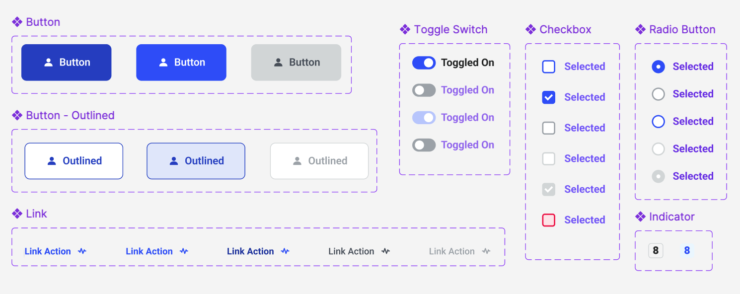
From there, my team built the system foundations and core components; buttons, drop shadows, and all the basic building blocks. We worked our way up from atoms to molecules and organisms until we had a marketing template that could be used consistently across the entire site for marketing and SEM pages.

Validating the Design System
For validation and testing, I decided to start with the pricing funnels. I knew the marketing team conducted a lot of A/B testing and conversion rate optimization on those pages, so I leaned on that existing framework. We took the components that had already proven successful in those marketing tests and used them as a foundation for our design system.
Whenever we updated or rebuilt those components, we validated the changes through the same A/B testing process with the CRO team. This ensured that each visual improvement we introduced wasn’t just theoretically better, but actually drove positive results and aligned with our business goals.
Result
The impact of implementing the design system was significant. In terms of engineering effort, we saw an exponential reduction in costs. Previously, a single page redesign could take about three months of engineering time. Now, with the design system in place, an engineer can create a new page in just three days. That’s a reduction from roughly 90 days down to 3 days, which is about a 96.7% reduction in time and cost.
Beyond the efficiency gains, we also ensured consistency across the entire website. Every component in the design system is maintained with consistent states, like hover and disabled states, so users have a more uniform and predictable experience. This consistency reduces cognitive load for users and helps minimize any friction that could lead to churn.
Finally, the design team’s velocity also improved. With a consistent system in place, the team no longer had to reinvent the wheel for each design. They could focus more on refining the user journey and the actual UX work, rather than getting bogged down in visual details.